Today we were looking at Staging.
This is the elaborate version of the notes I made during class.
Staging basically refers to how you compose your pictures. How you position things affects what you’re trying to convey to the audience.
Staging applies to storyboards, animatics and the animation itself.
As with we said with storyboards, we have to ask ourselves if the staging is both clear and interesting. Our teacher emphasised how important it was to get the balance right between these two factors.
When creating a shot either for a storyboard, animatic or animation there are some common problems which you can come across.
- The drawings are too vague.
It’s easier to quickly scribble something which you, the artist, can understand but others can’t.
- The drawings are over-detailed.
Storyboards and animatics only need to convey the narrative points. We don’t need to see the wood grain on the table or the freckles on someone’s face. Adding too much detail on a storyboard and animatic simply wastes time.
- The drawings are all in the center of the frame.
Having the figure or action in the center of the shot all the time becomes boring. Our teacher feels that putting things in the middle of the screen tends to create a calming effect – the character is center stage, everything is balanced and all is well in the narrative.
Following on from the last problem, our teacher emphasised how each shot we make has to be carefully thought about. You must be thinking in terms of using the whole screen.
This is where the Rule of Thirds comes in.
The Rule of Thirds is a (primarily photographic) principle where you split your screen/image in to thirds so you have 9 different sections. The points where the lines intersect are hotspots – points of interest. By placing your subject along the lines or on the hotspots, you create a more balanced image. This follows the theory that people naturally look towards the hotspots rather than the actual centre of the image.
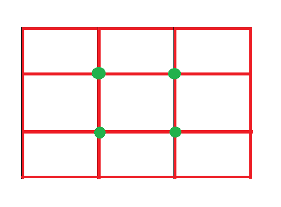
For good examples of the Rule of Thirds in photography, see: http://takeandtalkpics.com/fundamental-fridays-rule-of-thirds/
When creating a storyboard or animation we must always consider where we want our audience to look. Therefore we mustn’t over-complicate the picture by filling it with too much content. Otherwise the audience will get easily distracted or confused and won’t understand the meaning of the shot. An over-complicated scene will have much more difficulty communicating it’s narrative point.
One picture should make one point and one point alone.
Another rule we looked at was the Golden Ratio

This is a visualisation of a mathematical formula. Its value = 1.618 approx.
It can be found in nature, Mozart symphonies and some mathematicians believe it can be used to create the most pleasing shapes.
In this case, the point where the spiral shape is smallest…
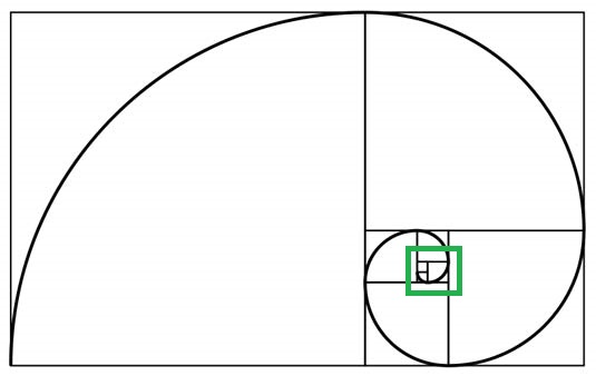
…Is the hotspot – the point of interest. The ratio still applies to portrait work as well as landscape if it’s rotated. It’s a very useful system which can be applied to all sorts of art. (The Renaissance artists liked it!)
Wherever we choose to place our characters or action we still want it to be around one third in to the shot. It’s not a good idea to have action happening in the furthest sections of the screen in the audience’s periforal vision.
Our teacher then went on to highlight how Gag Cartoonists were masters of Staging, for example Charles Adams. For some excellent examples of his work see… http://www.newyorker.com/cartoons/bob-mankoff/charles-addams
Every picture tells a story and this is the case with Charles Adams’s work. Each cartoon provides a snapshot to a scenario. The way the information is presented conveys the message as clearly as possible. I love his “Addams Family” sketches as the humor can sometimes be so subtle, but never fails to make me giggle!
From there, we were given a series of reminders to consider for future and current projects.
We must remember to think about foreground, middle ground and background and pick which one of these we want our action to occur in.
When drawing we must consider the marks we make. The marks are what make drawings interesting – lighter lines are good for backgrounds while thicker, stronger lines emphasise the details of the foreground.
Staging can become more complicated when you have more than one character. You must think about who the dominant character is.
Crucially a different placement says different messages.
That’s all for today! Tune in next week for more!
