Unfortunately although I said i’d be making more posts about the progress of the amendments I was making, during the period of time after I said that I suddenly found myself very busy!
When I got round to making the amendments it only took a few hours and posting on the blog in all honesty was the last thing on my mind. However, learning about the time stretch tool was very useful and i’m very much appreciate the tip from James Wright our sound person which led me to this!
Anyway I can’t do any thing else to it now! It’s been submitted for assessment!
That is the end of DDD for this year! It’s been an adventure; sometimes tiring, frustrating and always challenging however it’s been great fun too! Tune in next September for Second Year!
Following some wonderful and extremely useful constructive criticism from one of my tutors, I’ve decided to try out some experimental tweaks on the Sound Design project.
The feedback was as follows
” You’ve got a very solid piece of work here – interesting collage of human voice with some very detailed processing and an immersive stereo width. I would be curious as to what your Audition Timeline looks like – be sure to take plenty of screenshots for research purposes. My only note is that it sounds quite linear – despite the tempo change in visuals, your audio still runs at a steady pace.”
So! What I shall endeavour to do is have a go at Time Stretching, a technique which I can learn about through online tutorials. Hopefully this will help improve the timings so the audio fits better with the fast and slower paced sections of the visuals.
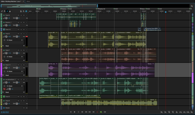
And also, following on from the comments about the Timeline, i’ll try to include more screenshots of the work as I go. For example below – this is a shot of the entire project at the point it is now, without any new changes made to it.
This is part of our Drawing, Drama and Design assessment for this term.
We had to create a 30 second piece of sound for a piece of animation. There were 6 pieces to choose from. I chose an abstract animation called “Night Music” by Stan Brakhage. I haven’t heard the original soundtrack so this is entirely my interpretation. I haven’t included the video in case I get in trouble with copyright infringement.
As it was called “Night Music” i thought the music of any night would be the sound of our dreams. The animation itself is like a psycadelic sequence of colours, with no recogisable shapes or images. Therefore the only thing to go by was the speed in which the frames occur and perhaps the intensity of the colour.
This was created and recorded using Adobe Audition and a Blue Snowball ICE microphone.
To set the basic ambience, i recorded my washing machine and reduced the frequency and tweaked various parts to get an interesting, low tone.
I compiled a mishmash of different pieces of spoken audio from various old projects of mine, songs or pieces of music and cut them all very short. The effect was like fliking through all channels on a television really fast. There are some discernable words in there, which could be memories, feelings or imaginings. These words and changes in tone of the speakers prompt emotional responses in the listener and will hopefully get them to engage with the piece more.
I added some filters to the vocals they had a little musicbox-like note with each voice. This combined with the droning, rhythmic background ambience makes the piece a little more musical.
There are some additional sounds like a small bell, a mosquito and running water – all which add to the distorted dreamscape we travel through.
So, it’s been a while, but here’s what’s planned for the next few weeks –
We have a Sound Design brief where we have to create an audio track to accompany a 30 second animated film.
The film in question I’ll be creating an audio track for is:
“Night Music” – Stan Brakhage
I haven’t’ heard the original soundtrack to go with it, instead the audio will be my own interpretation of what I think would fit well to the animation.
I picked the film primarily because I liked it’s colours and it’s abstract quality. It’s obscurity opens up a lot more room for subjective, personal interpretations and this includes sound. As there are no recognisable objects or characters that require a more specific sound, I can be far more creative with creating a “synaesthesic” soundtrack, using sound to represent the sensation and emotion evoked in the film.
Films which have inspired me in the past include Norman McLaren’s works:
Blinkety Blank
Boogie Doodle
I’ll be recording my own sounds and music, as well as perhaps employing pre-made sound effects from the internet and seeing how I can manipulate all these.
This is the elaborate version of the notes I made during class.
Staging basically refers to how you compose your pictures. How you position things affects what you’re trying to convey to the audience.
Staging applies to storyboards, animatics and the animation itself.
As with we said with storyboards, we have to ask ourselves if the staging is both clear and interesting. Our teacher emphasised how important it was to get the balance right between these two factors.
When creating a shot either for a storyboard, animatic or animation there are some common problems which you can come across.
The drawings are too vague.
It’s easier to quickly scribble something which you, the artist, can understand but others can’t.
The drawings are over-detailed.
Storyboards and animatics only need to convey the narrative points. We don’t need to see the wood grain on the table or the freckles on someone’s face. Adding too much detail on a storyboard and animatic simply wastes time.
The drawings are all in the center of the frame.
Having the figure or action in the center of the shot all the time becomes boring. Our teacher feels that putting things in the middle of the screen tends to create a calming effect – the character is center stage, everything is balanced and all is well in the narrative.
Following on from the last problem, our teacher emphasised how each shot we make has to be carefully thought about. You must be thinking in terms of using the whole screen.
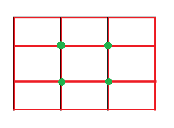
This is where the Rule of Thirds comes in.
The Rule of Thirds is a (primarily photographic) principle where you split your screen/image in to thirds so you have 9 different sections. The points where the lines intersect are hotspots – points of interest. By placing your subject along the lines or on the hotspots, you create a more balanced image. This follows the theory that people naturally look towards the hotspots rather than the actual centre of the image.
When creating a storyboard or animation we must always consider where we want our audience to look. Therefore we mustn’t over-complicate the picture by filling it with too much content. Otherwise the audience will get easily distracted or confused and won’t understand the meaning of the shot. An over-complicated scene will have much more difficulty communicating it’s narrative point.
One picture should make one point and one point alone.
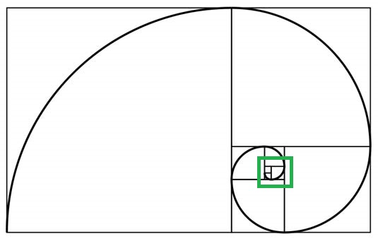
Another rule we looked at was the Golden Ratio
This is a visualisation of a mathematical formula. Its value = 1.618 approx.
It can be found in nature, Mozart symphonies and some mathematicians believe it can be used to create the most pleasing shapes.
In this case, the point where the spiral shape is smallest…
…Is the hotspot – the point of interest. The ratio still applies to portrait work as well as landscape if it’s rotated. It’s a very useful system which can be applied to all sorts of art. (The Renaissance artists liked it!)
Wherever we choose to place our characters or action we still want it to be around one third in to the shot. It’s not a good idea to have action happening in the furthest sections of the screen in the audience’s periforal vision.
Every picture tells a story and this is the case with Charles Adams’s work. Each cartoon provides a snapshot to a scenario. The way the information is presented conveys the message as clearly as possible. I love his “Addams Family” sketches as the humor can sometimes be so subtle, but never fails to make me giggle!
From there, we were given a series of reminders to consider for future and current projects.
We must remember to think about foreground, middle ground and background and pick which one of these we want our action to occur in.
When drawing we must consider the marks we make. The marks are what make drawings interesting – lighter lines are good for backgrounds while thicker, stronger lines emphasise the details of the foreground.
Staging can become more complicated when you have more than one character. You must think about who the dominant character is.
Crucially a different placement says different messages.
Today’s seminar saw us looking a little closer at storyboards and various examples of animatics. This should help us gain a deeper understanding what makes a good animatic, allowing us to better communicate narrative points. This will all be applied to our animation principles work, where our production teams will have to create these very things in the pre-production stages of our Animation Project.
This is a more elaborate version of the notes I collected from the session.
Storyboards set the direction of the film. Our teacher argued that storyboard artists are just as much the directors of the film as the actual directors are. They’re really important as they give an overall idea of the film.
Animatics are far more time based. They give much more of an idea of how the narrative and action will flow, they can be a great tool for calculating how much work will need to go in to each shot, how long these need to be and provide an early editorial opportunity. Something that looks good on a storyboard may not be half as effective when translated in to a more filmic medium. Crucially therefore, animatics are time savers – they save a lot of work further along.
Our teacher emphasised that it was important not to see the animatic as set in stone. It’s very fluid and can be moulded throughout the production process if need be. It allows you to make a lot of your mistakes a lot earlier on.
We then looked at an excellent example of an animatic from the Disney/Pixar film The Incredibles
They had employed both 2D and 3D resources in to this scene with some backgrounds being 3D, allowing the virtual camera to smoothly travel through them.
The characters themselves were most likely digital 2D.
There was a lot of contextual detail in that there was a lot of narrative information being conveyed, but there was little animation detail. There was no lip-synch, the backgrounds were simple and they only changed the poses and expressions of the characters when they had to.
We had to consider the importance of staging –
When composing a shot it’s wise not to have everything in the centre of the frame.
We need to consider the 3 planes we’re working on:
Background
Middleground
Foreground
When creating a storyboard, it’s tempting to create it starting at the beginning and slogging your way through. However it’s better to be flexible, you can create a rough script then work on one part, then another and then see how these scenes would fit together.
With animatics, it’s crucial not to think of them as a film storyboard. Think of it in layers, with characters, backgrounds and props etc. These can then all be moved around accordingly. Shape it and remould it until something works.
It was interesting to compare the previous example of an animatic (from The Incredibles) with the next example from the Television series, Futurama.
Given it’s television format, the animatic had to be “nailed down” as it was going to be shipped off to another country to be animated.
The narrative is very clear but the production is very different – the artists have filled in sounds with whatever would suit at the time and have had people stand in for actors. This goes to show how an animatic is a fluid, ever changing thing. The narrative is the most important thing you’re trying to convey. The sounds help with timing, and give an idea about what the scene will look like.
Storyboards have to balance two criteria to be effective:
They must be clear
They must have visual intensity.
Every drawing you’re doing has to tell the story. The stories have to be nice and clear, you have to communicate what you’re trying to say – the Narrative Points. Ask yourself, what am i trying to say in this scene?
Don’t over-detail scenes because there’s no need to at this stage. Over-elaborate illustrations aren’t often effective in communicating the basis of your idea and waste valuable time.
Today’s class saw us looking at the importance of Animatics and Storyboards.
As is before, here is a slightly neater version of the notes I got from our class.
The main points that lead up to a Storyboard and Animatic being made in the pre-production process are:
Initial Concept – Whatever your idea may be.
Synopsis – a few lines describing the idea.
Story development – expanding on the synopsis, asking questions about it like where? when? who? And most importantly why? This is important because we’re not only looking at the surface meanings but also the deeper messages and meanings in the film. As we discussed last week, on the surface “Toy Story” is about toys coming to life. However at its heart, the story considers the fear of rejection.
Camera Script – Setting up shots, considering staging and how many shots you’ll need.
Blocking – roughly working out where characters are, thinking about how the audience will see things, lighting and so on.
Expanding on these points, the Initial concept is simply the idea. It’s the “seed” of the story. We’re advised to start with a “seed” idea and work the story up from there, layering new ideas on top of it. Rather than trying to come up with a whole fully formed idea in one go. A Synopsis will then summarise the “bones” of the story. It is not a huge long detailed narrative.
Once you have a synopsis you should have an idea of the narratives general direction. This is when you develop the story. You can work out a beginning and ending. We’re told you wouldn’t be expected to have a completed script, you should have a work in progress.
One good tip we picked up was because animation is such a visual medium – Don’t tell something that can be shown visually. Therefore when it comes to dialogue, be “delicate” (as our tutor put it). Voiceovers can be tedious if they’re just describing to us what’s on screen. However they can also be effective, for example if what the narration is saying contrasts with the visuals, it can be very funny.
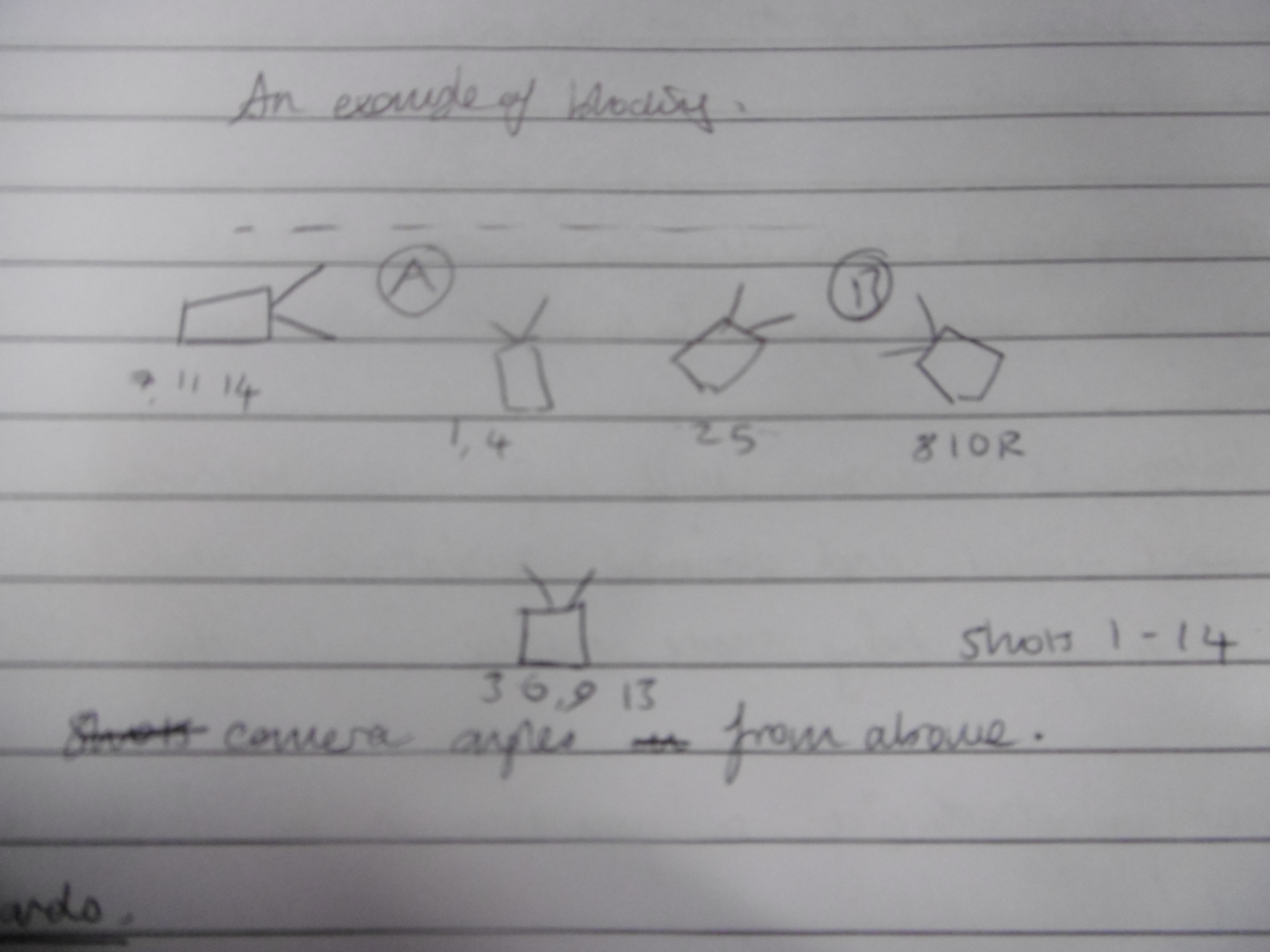
Camera Scripting is where the director decides things like cutting from shot to shot and framing. Blocking is where the angles for each shot can be choreographed.
this is a small diagram of an example of blocking.
From there you should have enough produced to create a storyboard.
“By working through the process of story and script in a detailed and methodical way you will leave yourself clear to produce a comprehensive storyboard with potentially the need for few changes.”
(Quoted from one of the slides in the PowerPoint today. I think it was made by Andy Joule, although our lesson was taught by Ron McCrae)*
One of the most important rules about Storyboards is that you need to put in enough shots. For a 4.5 minute section of animation our teacher told us how there were roughly 250 frames in the storyboards. That’s roughly 1 frame per second. It all depends on what the actions is.
Animatics.
After storyboards you can move on to animatic. Animatics are a key part of pre-production. Our teacher emphasised the importance that Animatics are NOT film storyboards, they should be an advance from storyboards. “You should regard it [the animatic] as a film”.*
They save time and therefore money in a real world situation.
They help make a clearer production schedule because you know how much work needs to be done on each shot.
An animatic defines the film structure and we can get an idea of how the film will flow and make changes if need be. It also helps you clarify the narrative.
It is also the first instance where you can properly apply Sound.
Sound is hugely important and should be considered as a major part of the pre-production process from day one.
Sound and dialogue will help you to create a better timed and observed animation and can lead to you being more creative with the animation.
“An Animatic without sound is unforgivable” (Ron McCrae)
When an animatic is completed, it should be continued to be worked on.
Each time a shot is animated, you can drop it over that shot in the animatic.
This will help you:
See how much you’ve completed and what’s left to do.
See whether your film makes sense now that it’s animated.
It helps you spot continuity errors.
Later today our production team, Fluxis, will be meeting to discuss our work – this lesson has been really useful for understanding the sort of work we’ll have to do in pre-production. We’re in the process of creating designs and storyboards so this is fantastic!
Today we had a lecture about Narrative, focusing on traditional narrative techniques. This is all part of our new subject, Production.
This is a summary of my notes from these lectures in preparation for an essay we’ll have to write later…!
Basically, the underlying structure of all stories is the same or similar.
The three core components of a story’s structure being:
Exposition – the beginning, where characters, locations and goals/aims are exposed. Exposition sets the scene, it is not the story itself.
The Narrative Arc – the main body of the story where there are problems which must be overcome in order to achieve goals, where the protagonist will experience things which will change them as a person, the events which lead up to a confrontation. For example, it can involve a journey, a set of tasks, or simply a set of events or meetings.
Resolution – the ending. The result of the journey, battle, learning experiences etc. It can be similar to the exposition, acting as a comparison to the exposition, but often shorter. Of course, some stories don’t resolve themselves – they can end on cliff hangers or twists. Narrative Arcs can also include false resolutions which can deliberately mislead the audience, leading them down perhaps a conventional path, then suddenly subverting it and rocketing the story off in a different direction.
We focused on Exposition using two film examples;
“Psycho” (1960. Dir. Alfred Hitchcock) and “Toy Story” (1996. dir. John Lasseter)
A story’s exposition basically had to answer these questions,
Where are we?
When is this set?
Who are these characters?
Why should we care?
Psycho begins in Phoenix, Arizona, on Friday the 11th of December at 2:43pm. We learn this through title cards as the camera pans around a wide shot of Phoenix. There is no year stated, meaning the action is just set in “modern day”. It makes ti easier for the audience to relate to and it’s more expensive to film a live-action movie in the past rather than modern times because of costumes, sets and continuity.
It then zooms in through a half open window in a building and we see two characters, a man and woman in bed with each other.
In the scene that follows we learn important things about them through their dialogue. These facts layout the main goals and problems in the film.
The woman is Marion Crane and she’s a secretary, the man is her lover Sam Loomis. A divorcee with money troubles. Marion wants to marry Sam and is tired of their meetings in shabby hotels. However, neither can afford to live together happily.
We soon work out Marion is the protagonist as we follow events from her perspective. The camera only uses her point of view in this part of the film. We only see one other character‘s point of view – Norman Bates, Marion’s murderer. As he’s the antagonist he’s equally important.
Her main goal: Marry Sam.
Her main problem: Money.
Why should we care? Marion is a sympathetic character, she’s in love but her circumstances are preventing her happiness.
What leads the narrative on after this exposition is something called “The Inciting Moment”
The catalyst that pushes the narrative forward in to the Narrative Arc. This can be a sudden discovery, a mysterious person imparting information, a sudden tragedy, something amazing like winning the lottery.
In this case, it’s where Marion decides to run away with the money she’s been entrusted with to take to a bank.
We see a new scene in her bedroom, the camera is focused on the envelope of money and pulls back to reveal that this is clearly not the bank, revealing a suitcase full of Marion’s clothes. We suddenly know exactly what Marion is planning.
It’s important to note the clever use of her perspective. We see what she sees when she looks at her papers and the envelope of money. Her constant glances at the money shows her moral ambiguity. She’s not a morally bad person and is torn between what to do.
However she eventually decides to run away as she planned. Putting the money in to her handbag. This shot us unnecessary because you wouldn’t put $40,000 in a handbag, but the audience needs to see this as it defines her decision and makes it clear.
The other example was Toy Story.
The exposition sequence shows us that the setting is in a normal American suburb, in a family home. It’s rather vague. We can assume the action takes place in a modern day setting. Because there is no dictated year, the action isn’t dated.
We work out Woody is the main character, when Andy is playing with him we see things as Woody sees them, not as Andy does.
One main difference between Toy Story and Psycho’s narratives is that Marion has a goal to marry someone. Woody already has everything he wants, he’s gone as high as he can – he has status as Andy’s favourite toy. He also has a presiding role over the other toys, reassuring them and acting as their leader. The story’s exposition and resolution occurs when the toys are most anxious; Andy’s birthday and Christmas. They biggest fear is being replaced and this is the same for Woody. Exposing his anxiety also exposes his goal. We discover Woody’s motivation through his downfall. He’s demoted from his position as Andy’s favourite toy by Buzz Lightyear and has to regain both Andy’s affection and the trust and friendship of his fellow toy while facing his fear of rejection.
We also get to see things from Buzz Lightyear’s perspective as he is Woody’s equal in status. Similar to Woody, Buzz has to overcome obstacles in order to reach some sort of resolution. Buzz has to find a reason for his existence as he breaks through his ignorance. He has to understand that he is a toy and not a real space ranger and accept it.
I never knew there was so much to Toy Story, I’ve always watched it for pleasure, rather than academic purposes but it’s interesting to see the story’s mechanics through a more thorough viewing!
Yesterday we headed off to the Victoria and Albert Museum to do our various drawings. I’d never been before and have never seen a wider collection of fascinating artifacts anywhere! There was just so much! It took 6 hours to get through just some of the criteria on our brief!
Our brief was to focus on cultures that weren’t our own, looking at how different cultures have developed their own “visual language”.
To begin with, this is a sketch I did of a Terracotta bust of Canon Edward Finch. (1728) by John Michael Rysbrack (1694 – 1770)
I just picked it out as it was characterful and realistic, two traits which I look for a lot in art – if I can positively connect with the piece then I find I empathise with it more. I liked Canon Finch’s knowing look and air of importance (not self-importance) he seemed wise and the sculpting nicely shows this off. I also love the detailing in the fold of his clothes.
I suppose you could say this can be my warm-up sketch, as this man is from my own culture. Still, I like this sort of work.
Canon Edward Finch (1728) Terracotta
Sketch
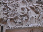
I then set off for Trajan’s column.
The architect of this column is thought to have been Apollodorus of Damascus and To describe it one word, I’d say “huge”.
This was my first impression of it. I felt completely dwarfed by the enormity of this incredible work. The level of detail is mind boggling. The whole column is entwined with various levels, each populated by thousands of figures, each filling out scenes in the story of the Roman Emperor Trajan’s victory over a people called the Dacians. There are 155 different scenes which spiral up the column like a comic strip. It may have been originally painted too, though nowadays of course it’s difficult to say what those colours may have been. The huge pedestal beneath it contained the Tomb of Trajan himself.
Sketches of the pedestal and details
detail on the column and wider sketch of the column
detail on column which I then sketched
detail on column
A mere half of Trajan’s column
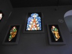
From there I moved on to Stained Glass.
This exhibition was lovely, truly beautiful. The installation itself was perfect – it was set along a long corridor with high windows on one side and a dark grey wall on the other with gleaming cabinets full of iridescent sacred silver. The darkness of the walls meant that all the colours in the illuminated stained glass were sang with gorgeous vibrancy.
Here, I was concentrating on how the figurative work is used to tell as story so I sketched the basic components of each scene to give myself an idea of how the lay-out and what devices were being employed to convey a narrative or message.
Glorious colour
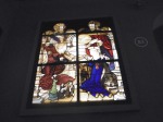
The Annuniation
Scene from the Life of Saint John of Damascus
This is a sketch in the simplest possible form of the scene called The Annunciation (pictured above). It uses very clear imagery and symbolism (a recurring motif in stained glass) to convey the story of Gabriel announcing to the Virgin Mary that God has chosen her from all women to bare his son. Inbetween them is a dove representing the presence of the holy spirit. Both Gabriel and Mary have halos symbolising their holiness and Gabriel is gesturing upwards to heaven. There is also latin writing, which is like a speech bubble for Gabriel as he reassures Mary that she is blessed.
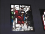
Here we have a scene (pictured above) from the Life of Saint John of Damascus. Similarly we can see the clear layout of the scene – Saint John is pictured on the right with a Halo denoting his status as a holy man. The man on the left is dressed in red (a powerful colour often denoting strength, passion or war-likeness) and is the Byzantine Emperor. He’s given status by being seated on a throne on a raised dais, i.e; he’s higher than everyone else. He’s gesturing towards Saint John, while Saint John is pointing to himself, indicating their discussing him. Saint John is pleading his innocence and there is a caption beneath written in Latin which translates as Saint John’s word, “God is my witness”. (The man inbetween is most likely a servant of the Byzantine Emperor and is holding a book open, perhaps indicating the law.)
I also sketched (but forgot to photograph, you can see the original via this link http://collections.vam.ac.uk/item/O8613/st-john-the-baptist-praying-panel-unknown/) the image of Saint John the Baptist praying in the wilderness. This caught my eye because of the number of animals depicted in the scene – we have some sort of pole-cat/stoat, a bear, a deer, a lion, a rabbit and a unicorn! It’s quite a mixture. It’s said that Saint John grew up in the wilderness. I just liked to see the dedication some artists put in to the life of the Saints.
From there, we move on to The Art of Indian Story-telling.
Story-telling is integral to Indian culture. Myths and Legends were told orally at first often through theatre and songs.
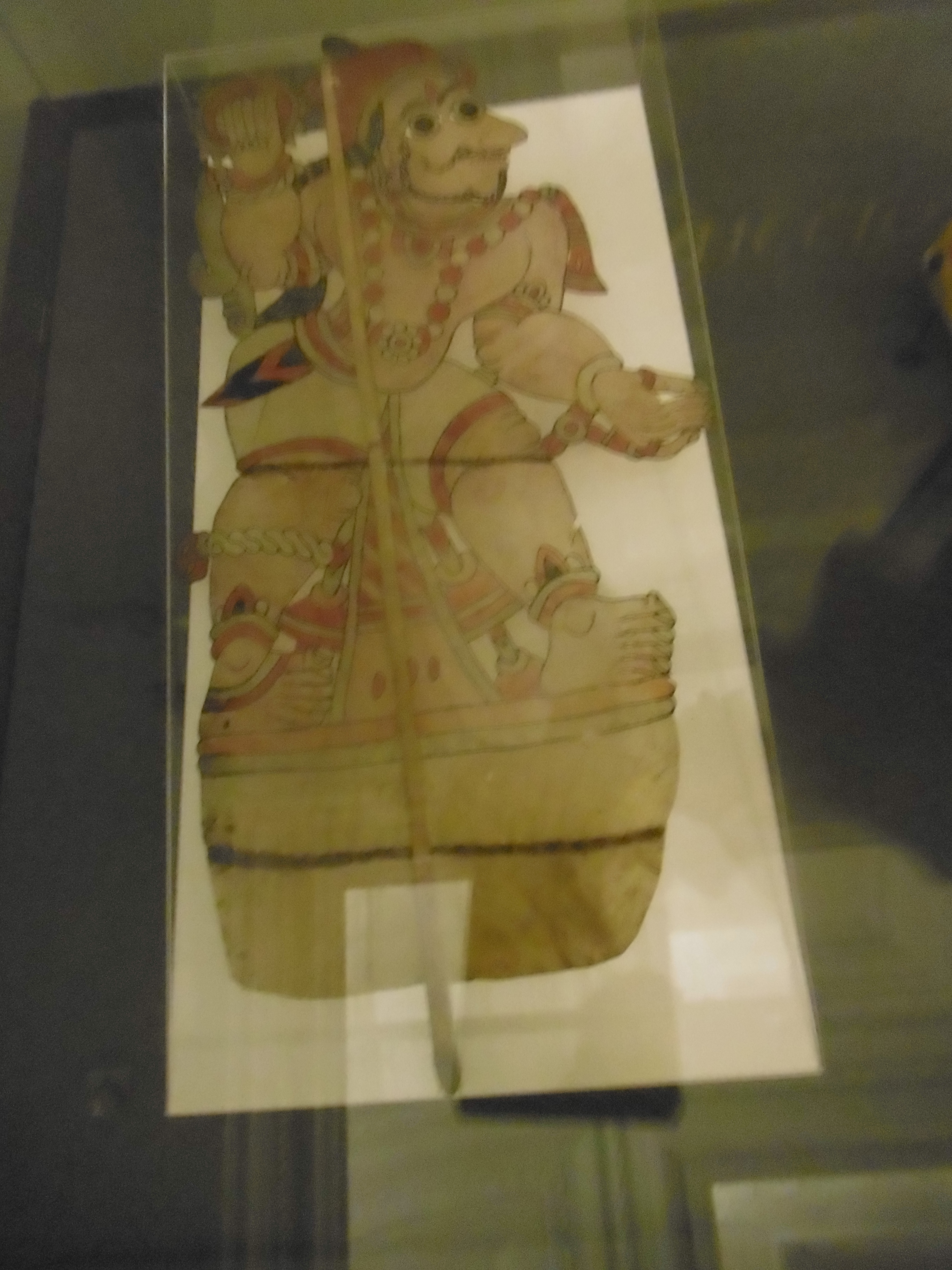
One of the methods of conveying a story was “Togalu Gombe Atta” – “Leather Puppet Dance”.
This was the puppet on display – A warrior. The way Togalu Gombe Atta worked was lapns were lit being screens and shadows from the puppets were project on to these. Some plays could go on for days! There was also accompanying music and songs.
This is a wonderful method of communicating a story and I found an example of this being employed in animation here,
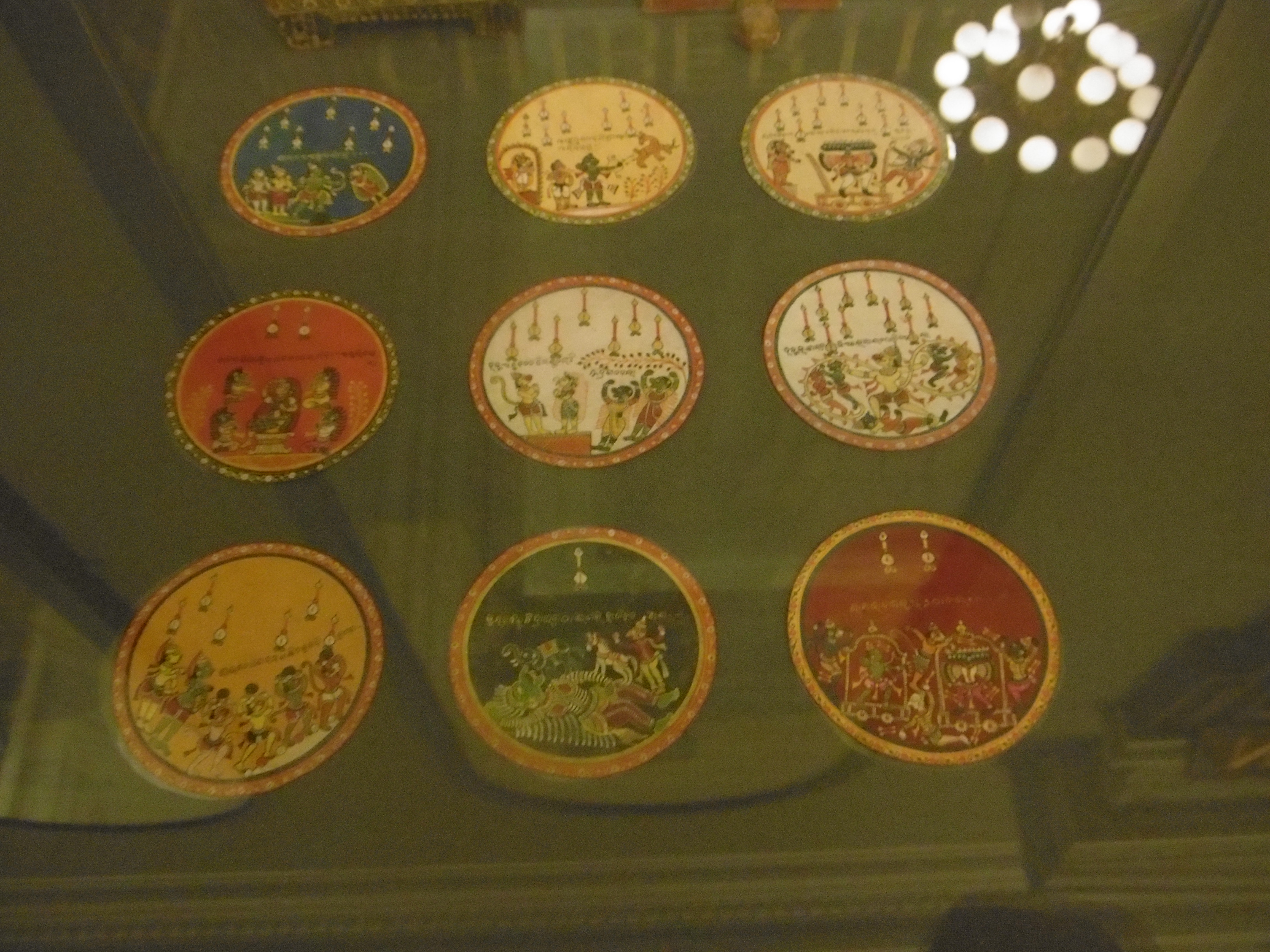
Another way stories were told was with Playing Cards, “Ramayana Ganjifa”.
These circular sets, called “Ganjifa” are about the size of a drinks coaster. Each one depicts a scene from the story Ramayana, a popular tale about the hero Rama who has to rescue his wife Sita from the demon Ravana, with the help of the monkey god Hanuman.
There’s a huge amount of detail in these cards, they were really stunning and it’s a unique was of telling a story I had never considered before.
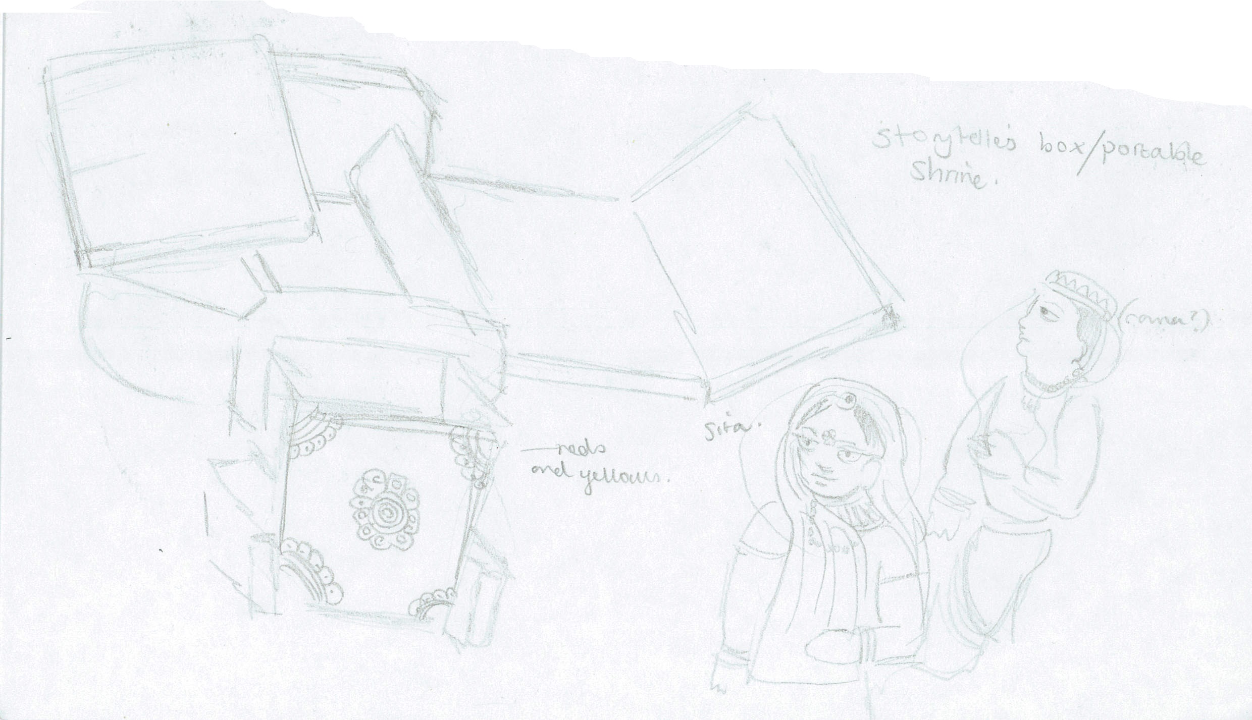
This gorgeous artefact is a Portable Shrine/Storyteller’s Box. These have been made in India for centuries. This example is called a “Kavadh” and the centre is a shrine to Sita (middle), the monkey god Hanuman (left) and Rama (right).
On the panels, scenes from the Ramayana and the life of Krishna are painted on. The panels were gradually opened and reveal a visual guide to the story as the storyteller opened them.
This is such a fantastic concept and this example is so beautifully painted, I love the use of reds and golds, it really brings out the characters painted.
I had a go at sketching them but I didn’t feel very confident about imitating the style and didn’t really want to. I didn’t feel right to copy this.
Moving on from India, I looked at visual communication in other regions of Southern and Eastern Asia, starting with Korea.
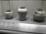
I found a collection of Porcelain pottery which caught my eye.
This pottery was from the Chosŏn Dynasty (also known as the Yi Dynasty).
Porcelain produced from pure white clay was reserved for the aristocracy. White had strong associations with Purity and Honesty and so was highly valued.
Cobalt blue was the favoured colour for decorating white porcelain and we can see some wonderful examples in the above images. I liked the subtly beauty of the floral sprays and could appreciate the work that had gone in to the more complex pieces.
One piece which caught my eye was called “Jar with Swelling Shoulders” (1750 – 1850) The main reason it caught my eye was the image in the middle set in an eight sided window and painted in the characteristic cobalt blue.
It depicts a boating party with birdlife, plant life and an imposing mountainous backdrop. I was drawn to the amount of detail and accuracy that went in to it. I enjoyed noticing little additions to the scene like the three people sitting in what seems to be a covered boat on the left.
I also liked the artists use of brush strokes to give depth to the scene; the water nearest to us has widely spaced ripples made with a single stroke. The water nearer the mountains has longer, denser strokes. This all added to the foundations of the scene, giving the whole image a sense of place. With a clear setting in a place that may well be real it suddenly gives the piece an extra dimension. It appears more genuine and makes the observer wonder what the history is behind it, to question and investigate it, drawing us in. That has surely got to be the mark of a good piece of visual communication.
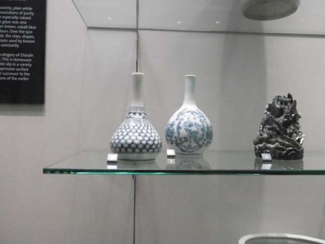
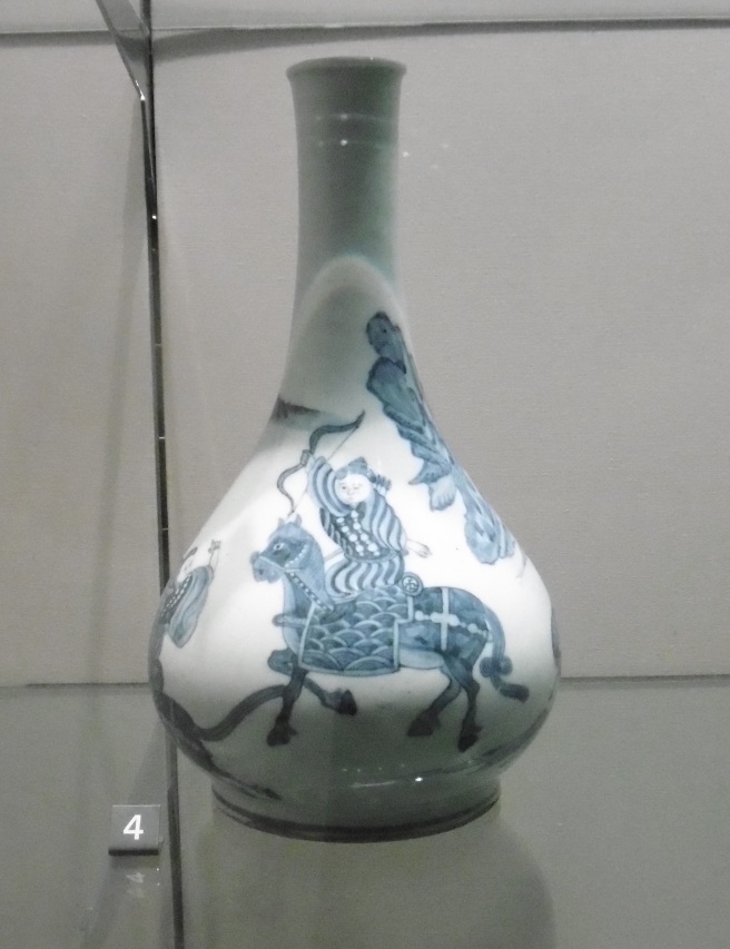
I also briefly sketched a pair of flasks, as I found their shape pleasing as well as their patterns.
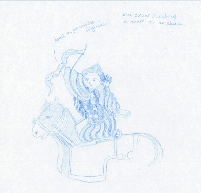
However one flask in particular had the most fantastic painting on it. A dramatic scene of a group of hunters. The central hunter was on horseback looking very fine with his bow helf aloft. I love horses and found the representation here enchanting. As well as this, as I drew I was amazed by the detail included – the Hunter’s fingernails, the little flushed blush marks on his cheeks and the brush strokes that make up the horses mane.
I tried to draw this in a similar shade of blue so I could better replicate it, of course that meant no erasing so it required an extra degree of concentration.
I feel ashamed I didn’t complete this one.
From Korean pottery to Buddhism! There was a whole array of Buddha’s all looking very impressive and peaceful down the same corridor as the Korean porcelain I had been admiring.
I was surprised to find out that there were so many meanings behind the statues and carvings – An information screen told me a huge amount about Figurative and Non-Figurative images of Buddha which proved fascinating.
Symbols in Buddhist sculpture have a wide variety of definitions. They may convey messages about the Buddha’s life and spiritual achievement or indicate the presence of Buddha. Or they might help us recognise us other important Buddhist figures such as Bodhisattvas like Avalokiteshvara and Tara.
Non-Figurative representations of Buddha.
Early on, Buddha wasn’t actually depicted in human form. Instead his presence was represented by symbols like Empty Thrones, Stupas or Dharmachakra.
An empty throne symbolises the seat of Buddha where he gained enlightenment. It also symbolises Buddha himself, as it suggests he’s the spiritual ruler of the world.
This is a small rough sketch I did of an image provided. I didn’t see the original carving.
A Stupa is a monument which came to symbolise the Buddha’s passing in to “Mahaparinirvana” which is the highest state of Nirvana. It means the Buddha’s release form the cycle of rebirth. It’s said that the Buddha’s cremated remains were entombed in eight Stupas in eight separate locations, hence why the Stupa came to represent the Buddha’s transcendence to Mahaparinirvana.
There is also the Wheel of Law (or Dharmachakra)
The eight spokes of this wheel symbolise the Buddha’s spiritual path, which is known as the “Eightfold Path of the Noble Ones”. It also represents the first time Buddha gave his teachings, in Sarnath, north eastern India.
Footprints (or Buddhapada) are a symbol of the presence of Buddha. These draw on the Indian custom of revering a religious elder by touching your head to their feet. Buddhapada are often depicted with the Dharmachakra. The Tree of Enlightenment can be found in Buddhist sculpture and represents the tree under which the Buddha achieved enlightenment. As well as all these things, we can also find Triratanas (Three Jewels) which are the three corner stones of Buddhist religion.
Figurative representations of Buddha.
Various characters in Buddhism have various meanings depending on things such as Asanas (certain postures), Attributes (objects) and Mudras (hand gestures).
These are all very important because for Buddhists, these figures aren’t just representations; They embody the divine presence. Buddhists worship these and give offerings.
Mudras are brilliant! These are hand gestures that you can see in any image of Buddha or a Bhodisattva.
Each gesture has different meanings, primarily related to major events in the Buddha’s life or else symbolising states of mind or spiritual qualities.
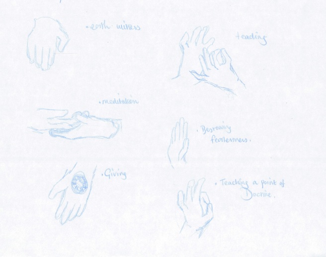
I then got very over-excited as I found examples of some of these in the surrounding exhibits!
Top right: Earth Witness, where the Buddha calls the Earth Goddess to witness his worthiness to become Buddha the moment before he achieves enlightenment.
Bottom right: Meditation
Left: a Bhodisattva (Tara) bestowing fearlessness.
It just goes to show how important an object can become. It’s amazing how people have created these symbols so as to understand, respect and communicate with their dieties.
After that, I feel no shame in confessing that after 6 hours in the museum I was thoroughly pooped and called it a day. But what a fascinating day it was! It’s certainly going to be a great resource for looking at different culture’s methods of visual communication!
We have an Assessment for Drawing, Drama and Design next monday which means no lessons that week or the week after. So keep an eye out for updates in a few weeks time!
Much to our surprised delight on this Monday morning however, our teacher merely gave us the brief and a hand out with tips on Gesture drawing. Then told us to hop off and do observational drawing for the rest of the day!
I didn’t know what Gesture drawing was, but got an idea from the handout – Gesture Drawing is about capturing the essence of the subject. When I got home I looked up some examples of gesture drawing and felt my heart sink as they seemed very different to the kind of bog standard observational sketches I had assumed to be the right thing to do.
Nevertheless, I still felt that today’s activity stimulated my observational skills and shook the dust off from my drawing abilities after the christmas break.
I did these sketches in various locations, focusing on people, objects/locations and animals. I particularly enjoyed sketching a pair of Collie dogs in the local park who really provided a challenge as I tried to keepup with their movements. I liked their characterful bounciness and their various poses and the fact that a few simple lines could show all this. (although very roughly)
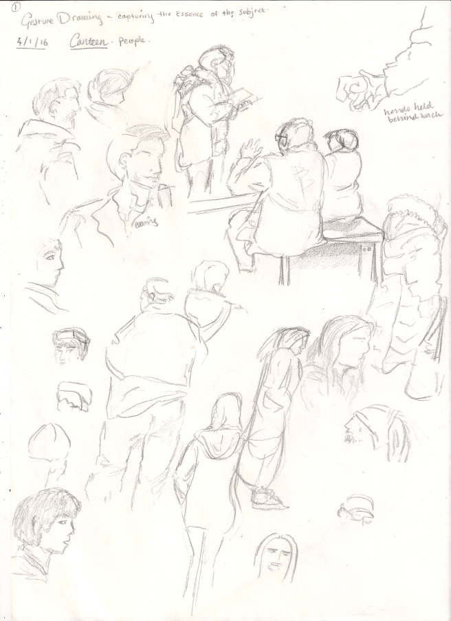
This first observational work is of people in the school canteen. I was using a 6B pencil throughout this session and rather regret it as it was difficult to work with; it was too heavy, I couldn’t accurately render some body parts or faces the way I wanted to. Maybe I need more practice sketching with softer pencils.
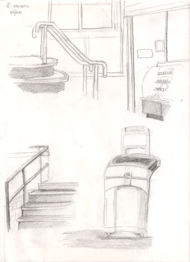
This is the interior of the canteen, I’m not at all happy with these. Definitely need to use a harder pencil.
However, the softer pencil was very effective at giving depth to the sketches.
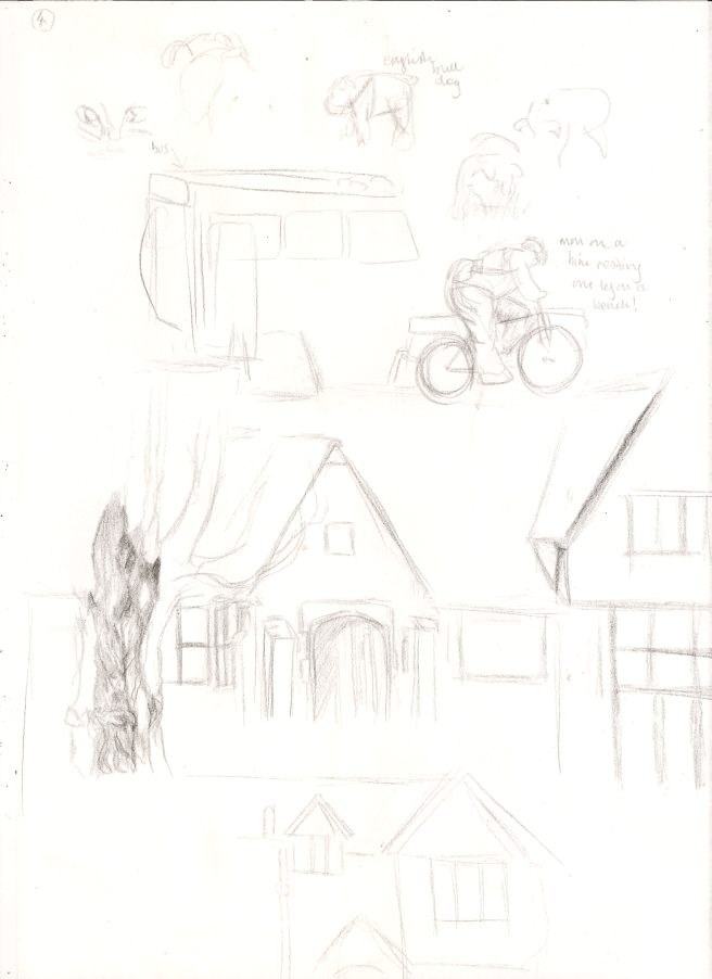
I much prefer these sketches – these were done in the local park, using an Conte Aquarelle Pencil, (without water) which comes out nice and lightly.
The dogs were particularly challenging as they moved about the most, yet I think their sketches are one of the better products from today.
More Sketches from the park, including a Man who was sitting on his bike but resting his leg on a bench, it was like he was posing in mid-cycle! I couldn’t believe my luck!
I had a go at sketching some of the surrounding buildings, these were a bit fiddly because of how geometric a building’s shape is in comparison to a dog catching a ball, nonetheless I enjoy drawing architecture. It’s pleasingly logical.
I got a little too involved in drawing the tree in front of the building, it was on the road to turning in to an illustration rather than a sketch; I was focusing too much on it!
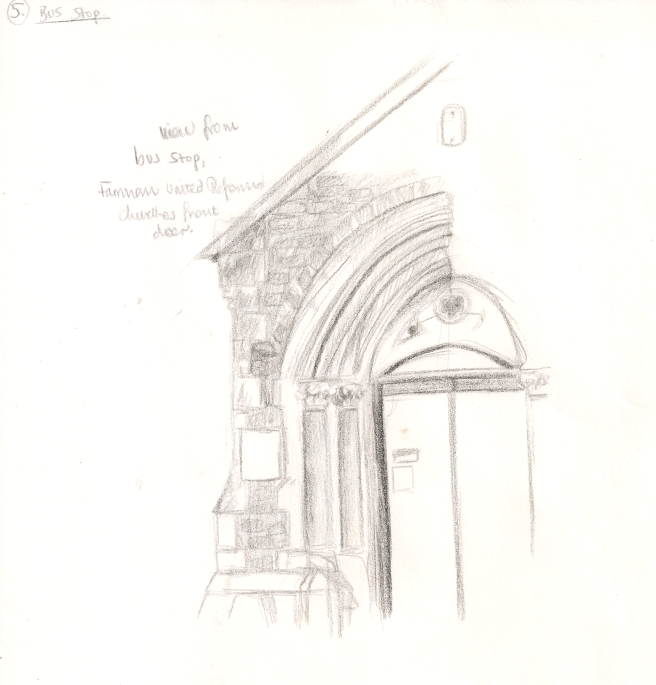
This is the Church opposite my bus stop where I continued my observational sketching. The church itself is quite big, intricate and full of lovelly architecture. I focused on the front doors, as it sort of encapsulates the whole church’s aesthetic. I may have gone a little overboard with shading, it’s defintley more than a sketch, but it was nice to be able to sit and draw something without it running off!
The Bus provided a fantastic array of people to draw, the only trouble was the seats often obscured their bodies and I could only draw the people in front of me (having a messy haired student twist around and stare at you your whole journey can be a little disconcerting! Some people may not want to be drawn) I’m quite pleased with the results, I could look closer than normal and focus on the faces of the subjects, some of whom were very characterful. It was a very enjoyable experience, (up until I got travel sick and had to stop!)
In a last ditch attempt to get some final sketches done, I challenged my drawing speed by trying to sketch passing parked cars or the back ends of cars in front of the bus. IT WAS VERY DIFFICULT! (Especially when the bus is moving a lot and you’re still feeling travel sick, but excuses excuses!) The fact is, I find it hard to draw cars quickly and need to practice more!
Tune in next time for more … well drawing! What else?! 😀